Chapter 9 Comparative Country Demographic Trend Graphs
This chapter will show you how to compare trend behavior of different demographics across countries. A comparative demographic trend graph can be shown in two different styles: either panels of graphs show the demographic trend by country, or panels of graphs showing the country trends by demographic. This chapter will demostrate how to create both.
9.1 Create Comparative Demographic Trend Graph
At the end, your code will look like the following:
df_list <- list(
  survey1,
  survey2,
  survey3
)

survey_dates <- c("Survey 1",
                  "Survey 2",
                  "Survey 3")

# One plot per Country
plot_trend_comp_demographics("Q1COVID19",
                             "gender",
                             df_list,
                             survey_dates,
                             "Country",
                             .caption = "Arab Barometer Wave VI")

# One plot per demographic
plot_trend_comp_demographics("Q1COVID19",
                             "gender",
                             df_list,
                             survey_dates,
                             "demographic",
                             .caption = "Arab Barometer Wave VI")
The code produces this graphs:
## Warning: Duplicated `override.aes` is ignored.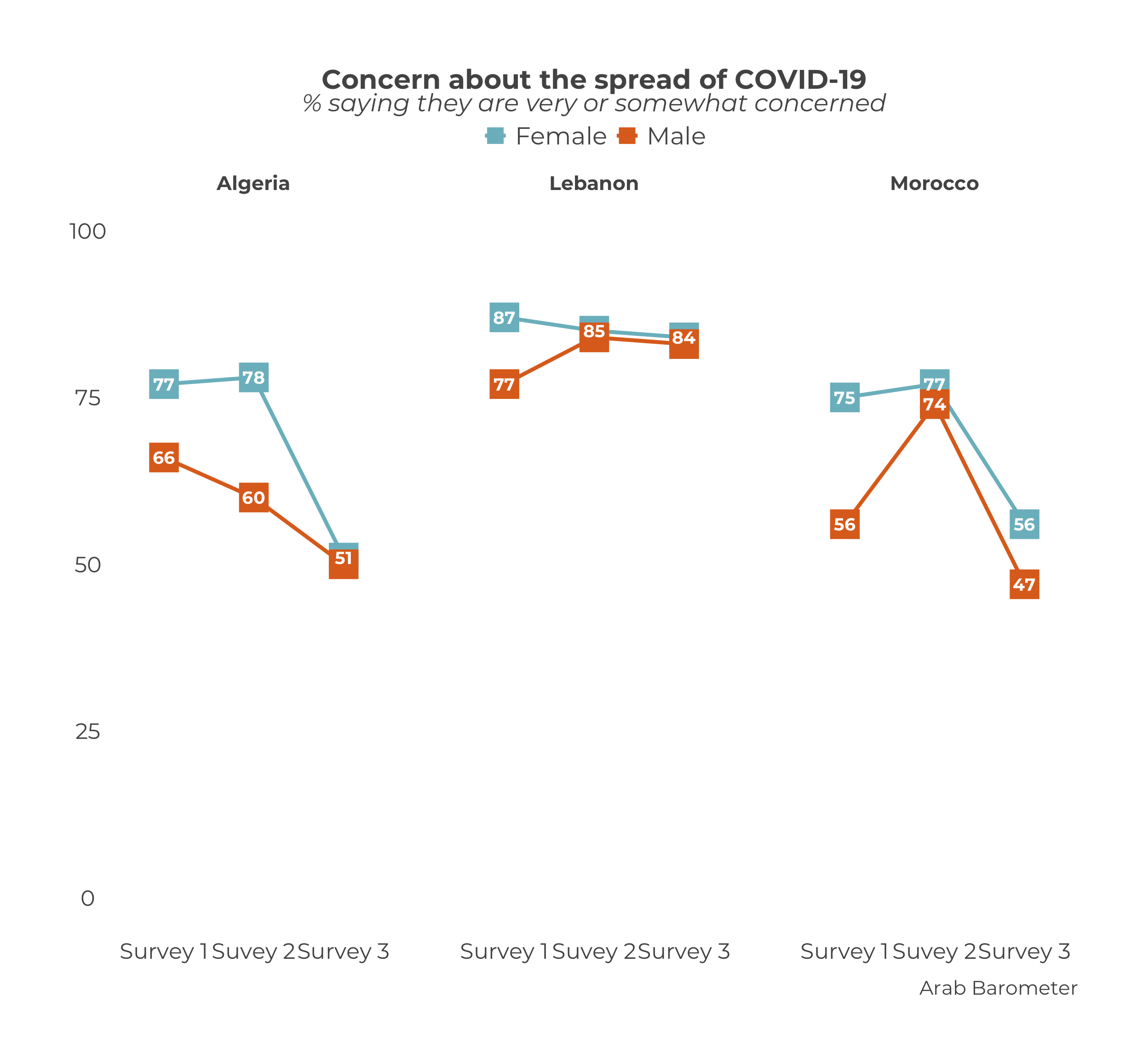
## Warning: Duplicated `override.aes` is ignored.
The code should look similar to that in the previous chapter. The main differences are the inclusion of the demographic variable and a line containing either "Country" or "demographic".
9.1.1 Prep Work
Similar to creating a demographic trend graph for an individual country, there is no need to create a summary. There is only one function to use: plot_trend_comp_demographics().
You can create the plot all in one step with the function, but it is prudent to do a little prep work before hand. This makes your work more clear and your life easier down the line.
Create a Data Frame List
The first step is to create a list of data frames. This section is exactly the same as the one from here.
There should be one data frame for each period you wish to graph. That is, each data frame should be from a different survey you want to include in your graph. In the example for the chapter, we’re using the three surveys from Wave VI, which we call survey1, survey2, and survey3. Each survey is its own data frame.
The list of data frames should be in the order you want them to appear (ideally, chronologically). The data on the graph will show up in the order of the list. So if you create a list in the order list(survey2, survey1, survey3), the data from survey2 will show up before the data from survey1.
Please note: This is ambivalent to language! The plot_trend_comp_demographics() function will assume the order of the list is the correct order, and treat it accordingly. When you enter a list as list(survey1, survey2, surveye3), the English graph will show the data right to left (survey 1 -> survey 2 -> survey 3), while the Arabic graph will show the data left to right (survey 3 <- survey 2 <- survey 1). You do not need to alter your input.
Create a Date Vector
This section is exactly the same as the one from here.
The next step is to create a vector of the dates you want to show on the x-axis of your graph. Branding guidelines call for the years in which the survey took place. For simplicity in the example, let’s just say "Survey X Year".
You need a date for each data frame in your data frame list. Otherwise, the function won’t know how to label the x-axis.
The dates should also be in the order you want them to appear. The dates should line up with the data frames. In the chapter example, the order of the data frames is survey 1, survey 2, survey 3. Therefore, the survey dates need to have the order survey 1 year, survey 2 year, survey 3 year.
Please note: This is ambivalent to language! Just as with the data frame list, the plot_trend_comp_demographics() function will put the data in the correct order according to the language of the graph.
Now that we have defined our data frame list and survey dates, we can create our demographic trend plot.
9.1.2 Plot a Comparative Demographic Trend Graph
To create a trend graph plot for an individual country, use the plot_trend_comp_demographics() function.
This function takes a few more parameters, and in a different order, than the functions we have worked with so far. In total, there are five necessary parameters: .var, .dem, data_frames, svry_dates, and .facet_choice. To see a complete list of parameters, including optional ones, use ?plot_trend_comp_demographics() in your R console.
The parameter .var is the variable you want to plot. It must have the same name in every data frame in the data frame list. If the variable you want to plot is named "Q101" in one sure, but "Q102" in another, the function will not include "Q102" in the plot. Computers can do a lot but as of yet they cannot think critically, so the onus is on you.
The parameter .dem is the demographic you want to see the variable trends for. Much like the .var parameter, it must have the same name in every data frame in the data frame list. If the demographic you want to plot is named "gender" in one sure, but "GENDER" in another, the function will break.
The parameter data_frames is a list of data frames. This is what we created here.
The parameter svry_dates is a character vector of dates that will show up on the x-axis of the graph. This is what we created here.
The parameter .facet_choice determines how your plot will be displayed. You may choose either "Country" or "demographic". If you choose "Country", the plot will contain a graph for each country showing the demographic trend for that country. If you choose "demographic", the plot will contain a graph for each demographic category showing the trend of each country for that demographic category.
Now let’s fill it in.
Option 1: Facet choice is "Country"
Let’s start with wrapping the graph by country, as that is likely the most common setting. Using this setting will produce a graph that has one title and subtitle, but multiple plots. Each plot will show a demographic trend plot for a single country.
plot_trend_comp_demographics(.var = "Q1COVID19", # Variable to graph
.dem = "gender", # Demographic to see over time
data_frames = df_list, # List of data frames
svry_dates = survey_dates, # Vector of survey dates
.facet_choice = "Country") # Facet choice to wrap by## Warning: Duplicated `override.aes` is ignored. Nearly there! What still needs to be changed?
The caption, of course! Just as in all the other plot_ functions in the ArabBarometR package, you can change the caption using the .caption parameter.
plot_trend_comp_demographics(.var = "Q1COVID19",
.dem = "gender",
data_frames = df_list,
svry_dates = survey_dates,
.facet_choice = "Country",
.caption = "Arab Barometer Wave VI") ## Warning: Duplicated `override.aes` is ignored.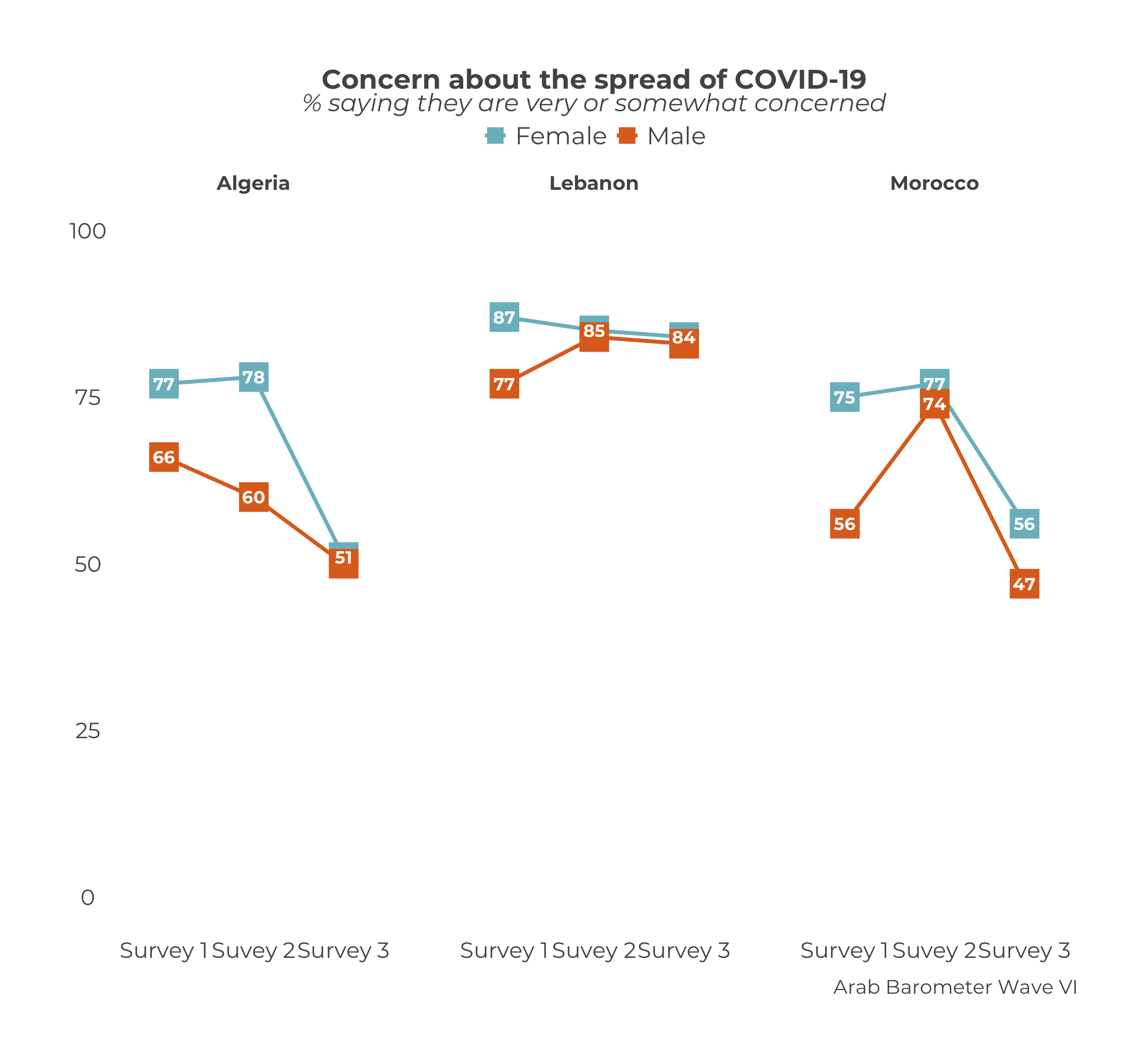
Putting all the steps together, we get the first half of the code we started with.
df_list <- list(
  survey1,
  survey2,
  survey3
)
survey_dates <- c("Survey 1 Year",
                  "Survey 2 Year",
                  "Survey 3 Year")
plot_trend_comp_demographics("Q1COVID19",
"gender",
df_list,
survey_dates,
"Country",
.caption = "Arab Barometer Wave VI")## Warning: Duplicated `override.aes` is ignored.
Option 2: Facet choice is "demographic"
Now we will go through how to wrap the graph by demographic. Using this setting will produce a graph that has one title and subtitle, but multiple plots, just as in the previous section. Now, each plot will show trend lines for each country, but only for a single demographic category.
In this example, we use “gender”. That means when we wrap by demographic, there will be one comparative trend graph just showing the trends of men and one comparative trend graph just showing the trends of women.
plot_trend_comp_demographics(.var = "Q1COVID19", # Variable to graph
.dem = "gender", # Demographic to see over time
data_frames = df_list, # List of data frames
svry_dates = survey_dates, # Vector of survey dates
.facet_choice = "demographic") # Facet choice to wrap by## Warning: Duplicated `override.aes` is ignored.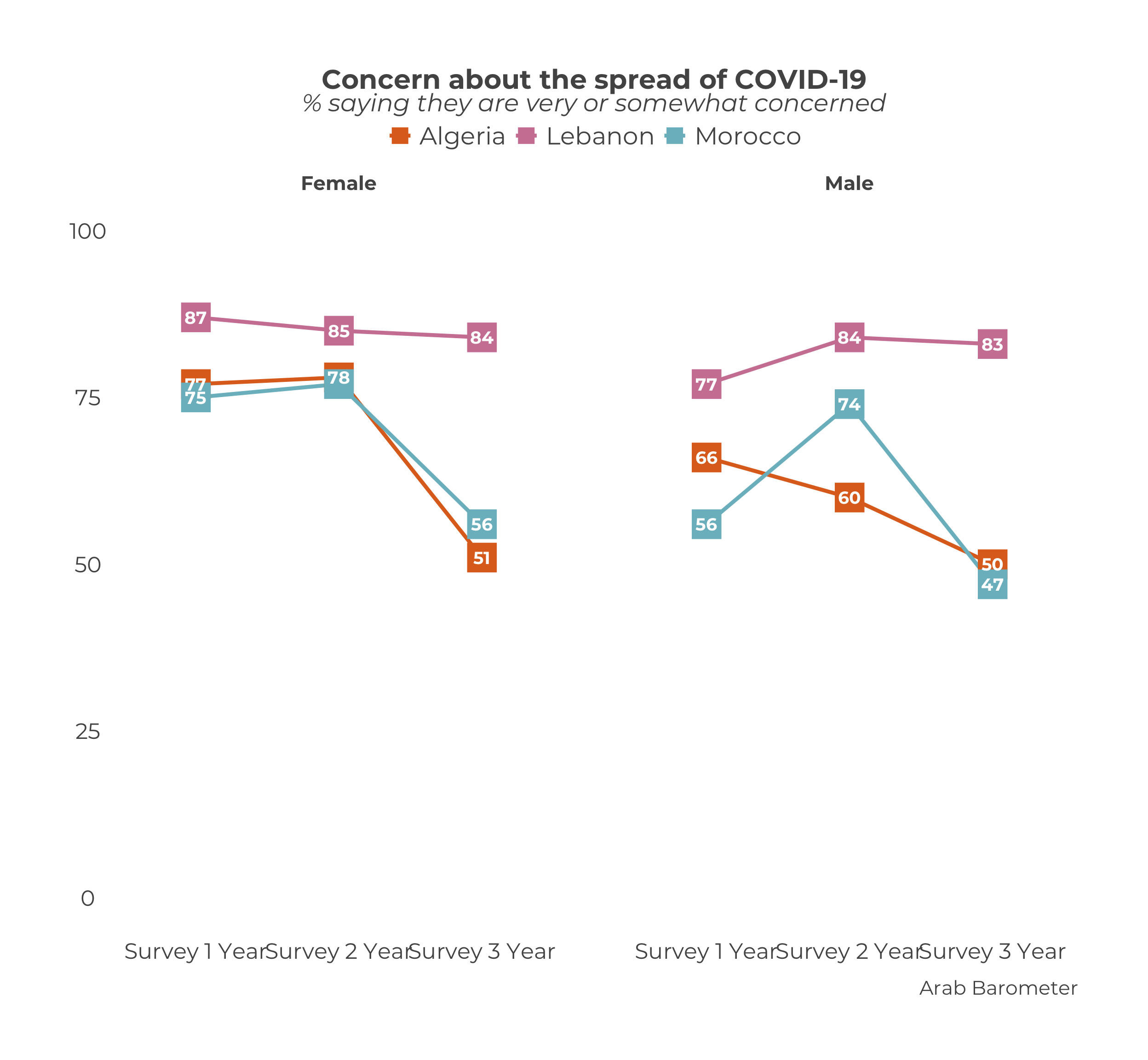 Nearly there! What still needs to be changed?
The caption, of course! Just as in all the other plot_ functions in the ArabBarometR package, you can change the caption using the .caption parameter.
plot_trend_comp_demographics(.var = "Q1COVID19",
.dem = "gender",
data_frames = df_list,
svry_dates = survey_dates,
.facet_choice = "demographic",
.caption = "Arab Barometer Wave VI") ## Warning: Duplicated `override.aes` is ignored.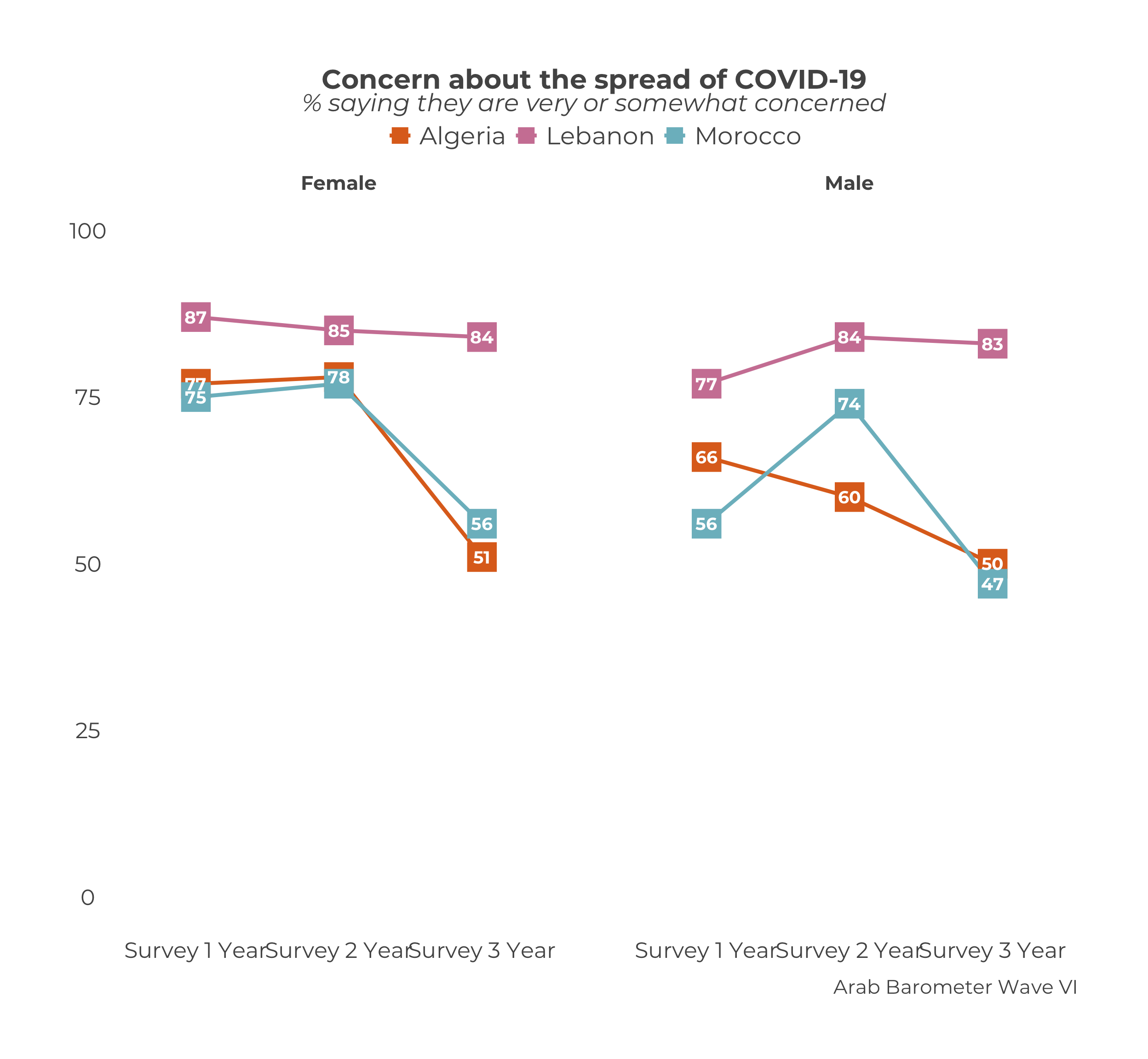
Putting all the steps together, we get the second half of the code we started with.
df_list <- list(
survey1,
survey2,
survey3
)
survey_dates <- c("Survey 1 Year",
"Survey 2 Year",
"Survey 3 Year")
plot_trend_comp_demographics("Q1COVID19",
"gender",
df_list,
survey_dates,
"demographic",
.caption = "Arab Barometer Wave VI")## Warning: Duplicated `override.aes` is ignored.
With both options demonstrated, we have the complete original code.
df_list <- list(
survey1,
survey2,
survey3
)
survey_dates <- c("Survey 1",
"Survey 2",
"Survey 3")
# One plot per Country
plot_trend_comp_demographics("Q1COVID19",
"gender",
df_list,
survey_dates,
"Country",
.caption = "Arab Barometer Wave VI")
# One plot per demographic
plot_trend_comp_demographics("Q1COVID19",
"gender",
df_list,
survey_dates,
"demographic",
.caption = "Arab Barometer Wave VI")9.2 Create Many Graphs
On a rare occasion, it is conceivable that you might want to create many comparative demographic trend graphs for a slew of variables. For the sake of simplicity, let’s assume you all the graphs to be displayed the same way and set the .facet_choice parameter to "Country" for the example.
A nice payoff of creating the data frame list and the date vector is that these objects (df_list and survey_dates) can be re-used any time you want to create a graph over the same time period.
For example, say you wanted to also create a graph tracking Algerian’s views of the economy and religiosity. The only parameter in the plot_trend_comp_demographics() function that needs updating is .var.
df_list <- list(
  survey1,
  survey2,
  survey3
)

survey_dates <- c("Survey 1 Year",
                  "Survey 2 Year",
                  "Survey 3 Year")


plot_trend_comp_demographics("Q1COVID19",
                             "gender",
                             df_list,
                             survey_dates,
                             "Country",
                             .caption = "Arab Barometer Wave VI")
## Warning: Duplicated `override.aes` is ignored.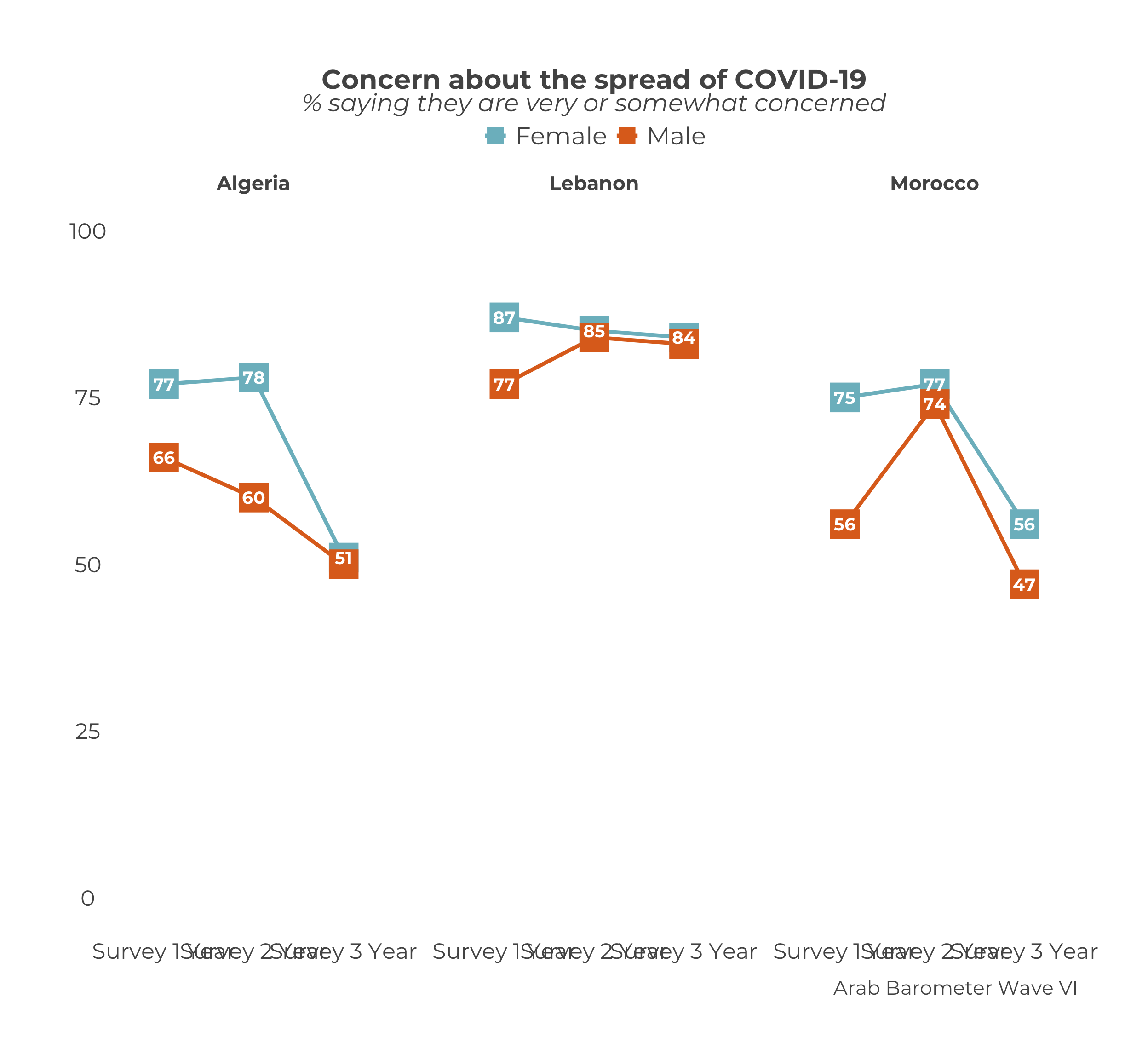
plot_trend_comp_demographics("Q101",
                             "gender",
                             df_list,
                             survey_dates,
                             "Country",
                             .caption = "Arab Barometer Wave VI")
## Warning: Duplicated `override.aes` is ignored.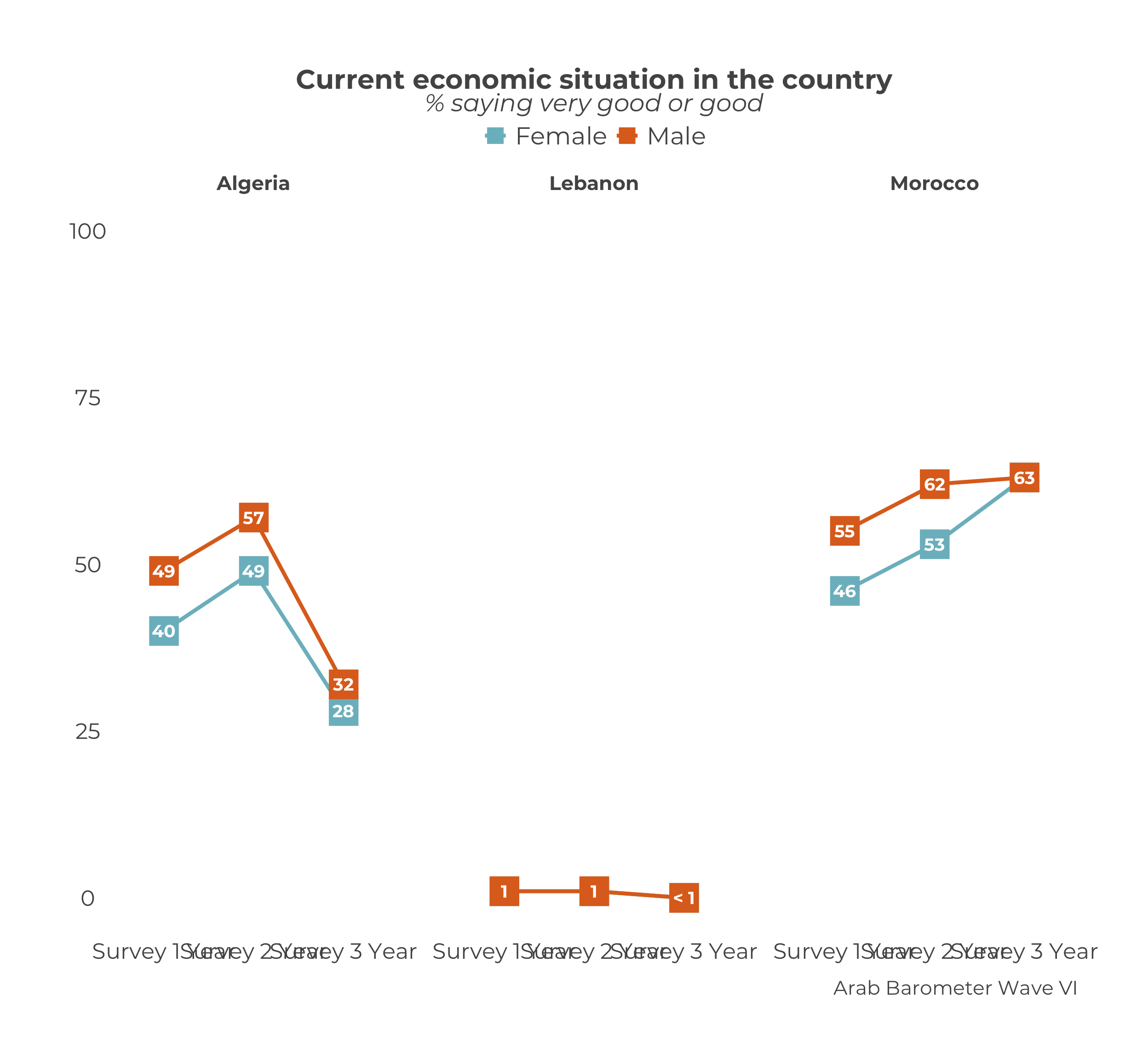
plot_trend_comp_demographics("Q609",
                             "gender",
                             df_list,
                             survey_dates,
                             "Country",
                             .caption = "Arab Barometer Wave VI")
## Warning: Duplicated `override.aes` is ignored.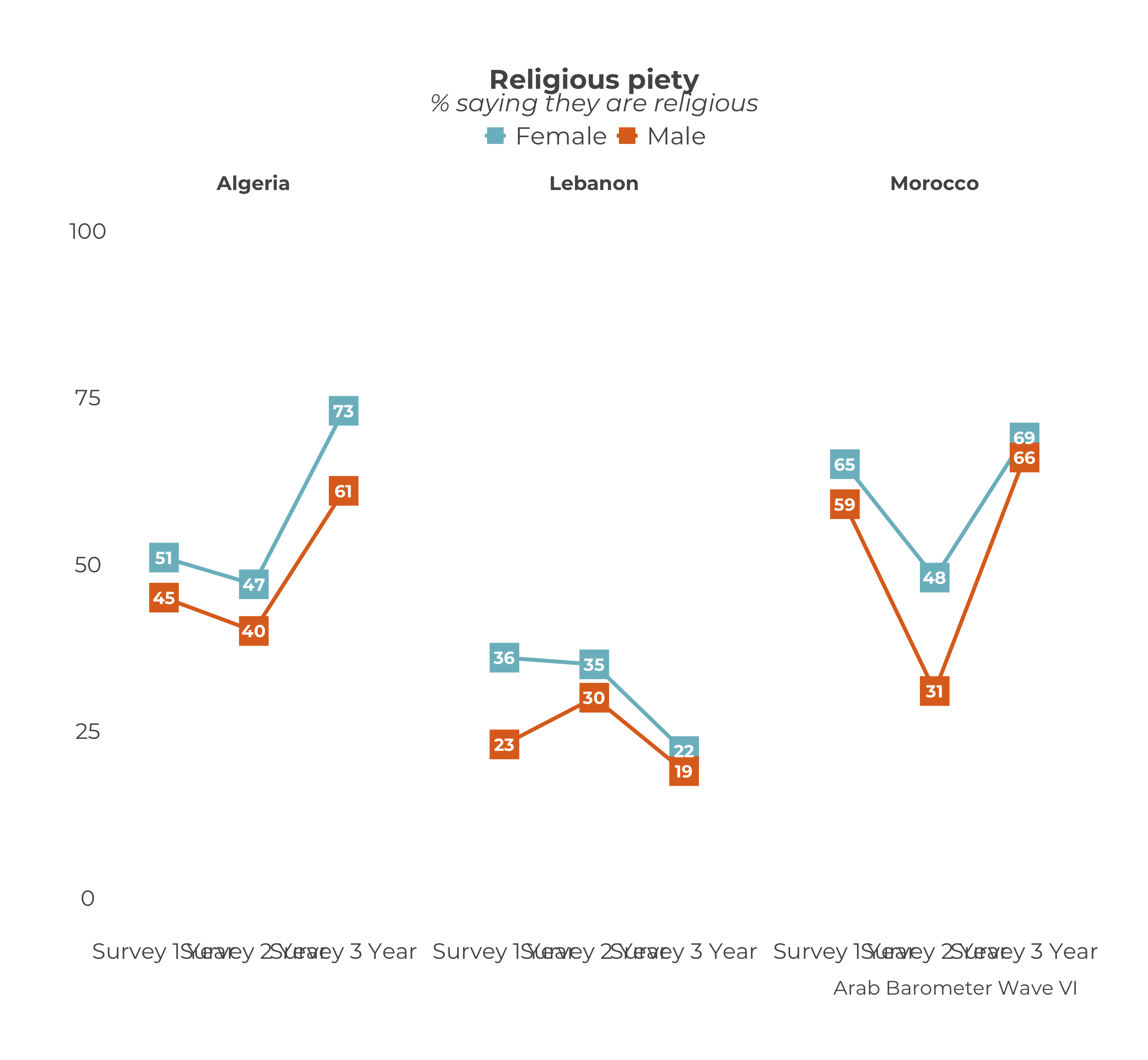
Notice that the code produced two graphs, even though df_list and survey_dates were only defined one time. Once you have created the df_list and survey_dates objects, you can re-use them for any graph that is covering the same time period.
You can also you the map() function from the purrr package. This method is essentially the same as what was done for creating many single country demographic trend graphs.
As a quick review, in earlier chapters the first step was identify the variables to plot. We did that by creating a named list of of the variables we wanted to plot.
The plot_trend_comp_demographics() function creates summaries internally, so once we identify our variables, we go right to the mapping step. We map a named list of variables to the plot_trend_comp_demographics() function. We want to create a graph for the same country over the same time period, just using different variable, so we hold the demographic, data frame list, survey dates, facet choice, and caption constant.
9.2.1 Identify the Variables
We are creating trend graphs for the variables Q1COVID19, Q101, and Q609.
variables_2_plot <- list("Q1COVID19",
                         "Q101",
                         "Q609")

names(variables_2_plot) <- c("Q1COVID19",
                             "Q101",
                             "Q609")
Now you have a names list of variables. Let’s plot them.
9.2.2 Plot the Variables
Recall we want to hold constant the data_frames, svry_dates, .facet_choice and .caption parameters because those will be the same for every graph. The only parameter we want to vary is .var.
plots <- map(
  variables_2_plot, # Vector of variables to plot
  plot_trend_comp_demographics, # Map to function `plot_trend_comp_demographics()`

  .dem           = "gender", # Hold constant the `.dem` parameter
  data_frames    = df_list,  # Hold constant the `data_frames` parameter
  svry_dates     = survey_dates, # Hold constant the `svry_dates` parameter
  .facet_choice  = "Country", # Hold constant the `select_country` parameter
  .caption       = "Arab Barometer Wave VI, Algeria"
  )
Excellent!
The plots have been saved to a named list called plots. To access the plots for each variable, you can use the $ and variable name.
## Warning: Duplicated `override.aes` is ignored.
## Warning: Duplicated `override.aes` is ignored.
## Warning: Duplicated `override.aes` is ignored.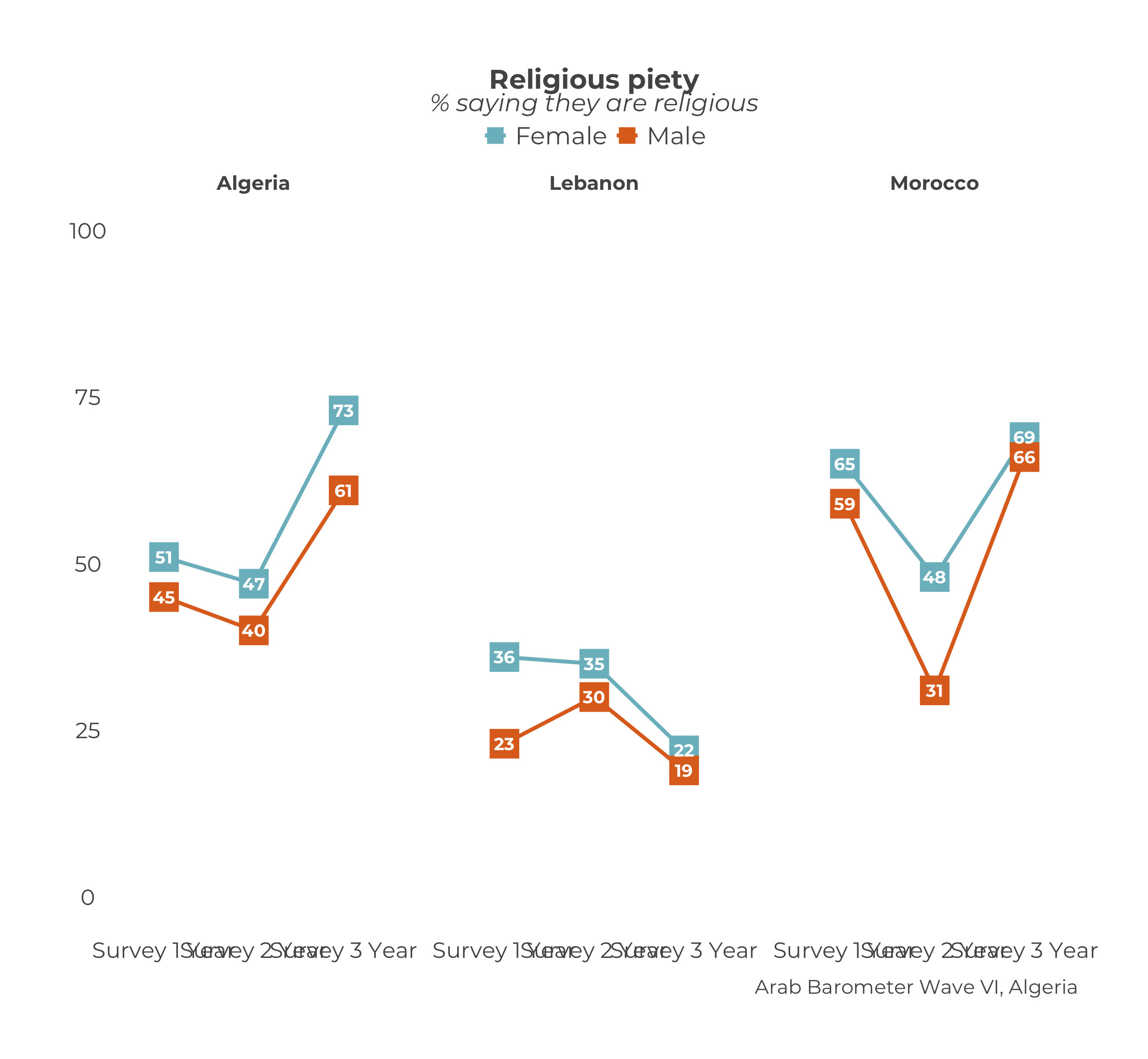
You’ve done it! You have created many trend plots at once!